LINKEDIN · IA AUDIT & REDESIGN

Why does it take 5 taps to edit your Linkedin Profile?

A little navigation problem that made me look at LinkedIn differently.

UX Research

Product Strategy

UI/UX Design

I had spent years freelancing.

So I started asking: what could make the experience better?

I had spent years freelancing. So I started asking: what could make the experience better?

Watch me walk through TalentPay, a freelancing platform concept shaped by research into the challenges freelancers face.

A quick look at the research, product strategy, user journeys, and design decisions behind the concept.

Short on time? Watch at 1.25× speed.

Short on time? Watch at 1.25× speed.

A little about this project

This started as a college assignment with a simple brief: understand how an app is organised, find what's making it harder to use, and improve that structure.

​

I picked LinkedIn because I already use it to share my work, connect with people, and build my career. I wanted to look beyond the screens and understand the thinking behind them.

​

That's where Information Architecture (IA) comes in. It's basically how an app organises things, names them, and helps you find what you need.

First, I mapped what was already there

Before changing anything, I needed to understand what LinkedIn had packed into its different sections.

​

So I went through the app and made a content inventory, a list of the screens, features, buttons and menus users could find.

Then I looked at how everything was connected

A content inventory tells us what's inside an app. An information architecture map helps us understand where everything lives and how the pieces connect.

​

I used the inventory to study LinkedIn's existing structure, its navigation and the way different features were grouped.

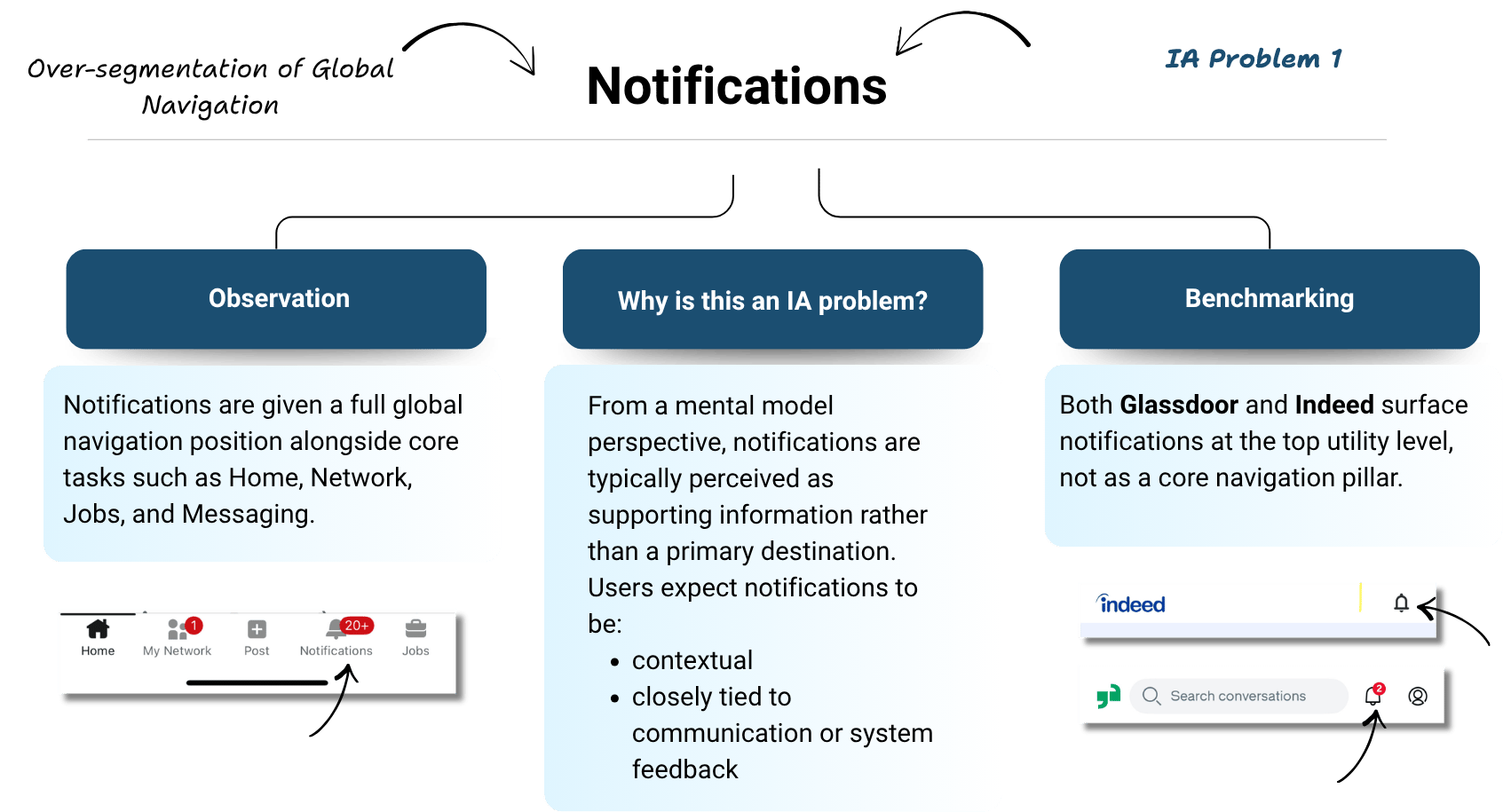
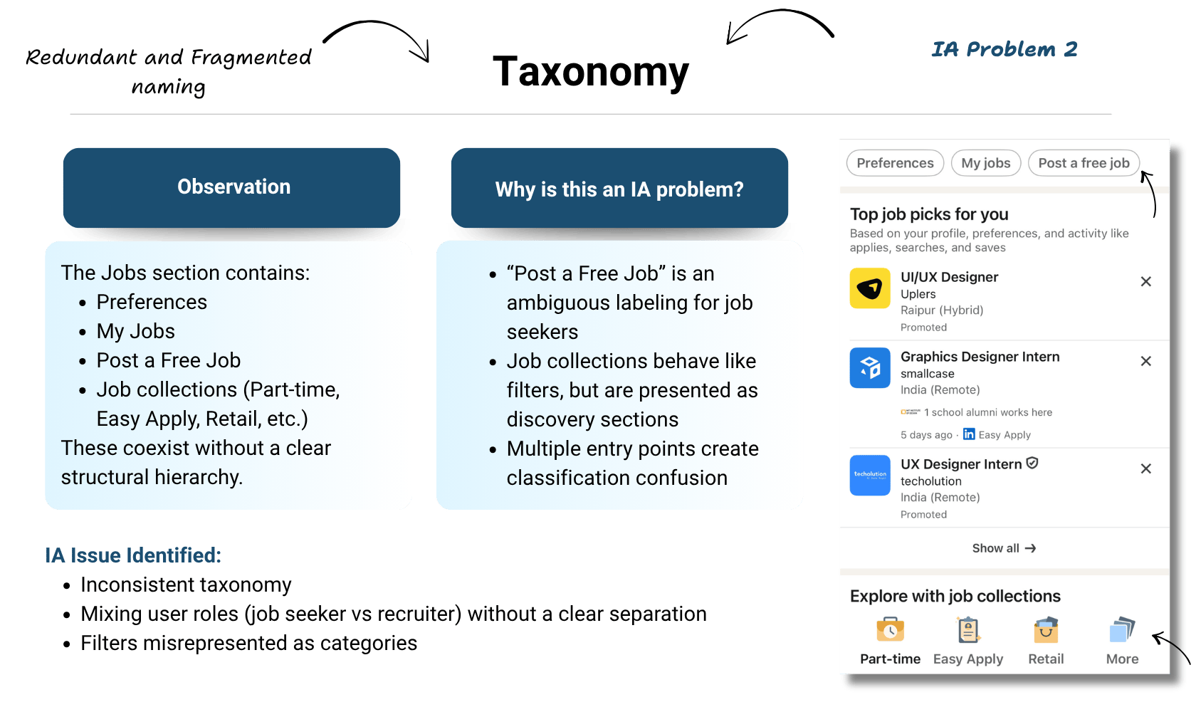
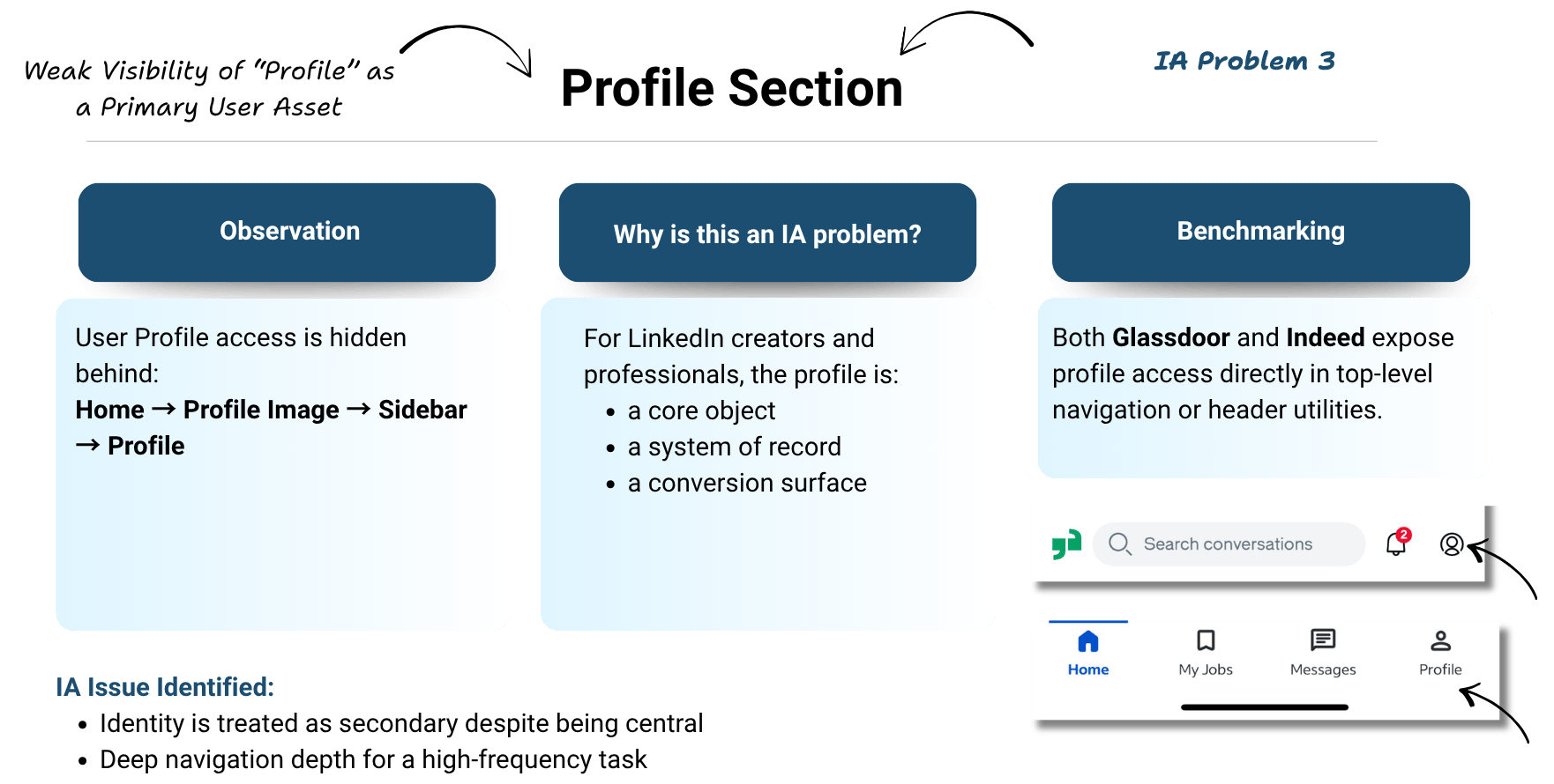
The three things that made me stop and look

I wasn't trying to prove LinkedIn was badly designed. I wanted to find the little things that could make everyday tasks easier.

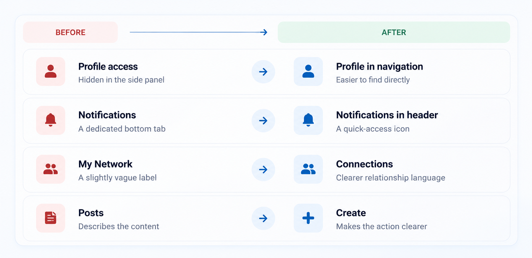
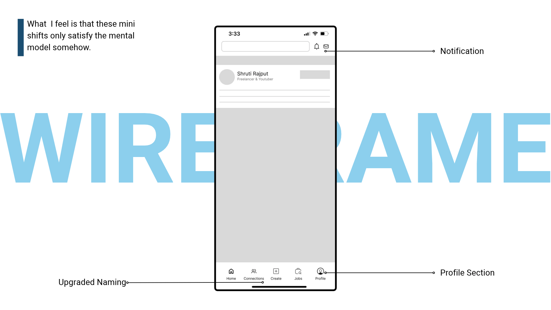
So, here's what I'd change

I didn't want to redesign LinkedIn just for the sake of it. I wanted to make a few focused changes while keeping the product familiar.

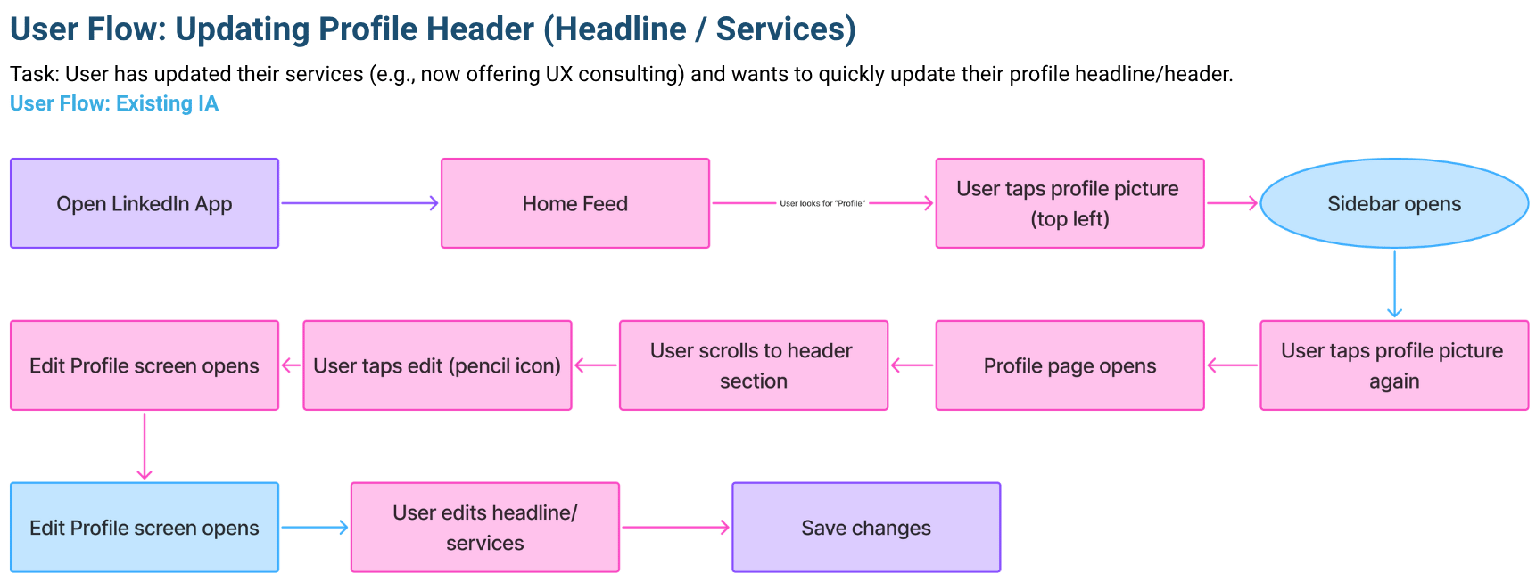
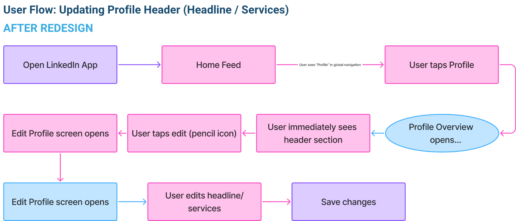
The biggest change: 5 taps to 2

This was the clearest example of why information architecture matters.

Imagine you've added a new service to your freelance business and want to update your LinkedIn headline.

What this project taught me

I started this project thinking I'd be organising screens and drawing navigation maps.

Instead, I learned to question things I had stopped noticing simply because I used them every day.

​

A label can seem obvious to the person who designed it and still confuse someone else. A feature can exist and still be hard to find. And a small change in where something lives can change how easily people reach it.

​

I also learned that having a good idea isn't the same as proving it works. My next step would be to put these changes in front of users and see what actually happens.

LINKEDIN · IA AUDIT & REDESIGN

Why does it take 5 taps to edit your LinkedIn profile?

A little navigation problem that made me look at LinkedIn differently.

UX Research

Product Strategy

UI/UX Design

I had spent years freelancing.

So I started asking: what could make the experience better?

Watch me walk through TalentPay, a freelancing platform concept shaped by research into the challenges freelancers face.

Short on time? Watch at 1.25× speed.
A little about this project

This started as a college assignment with a simple brief: understand how an app is organised, find what's making it harder to use, and improve that structure.

​

I picked LinkedIn because I already use it to share my work, connect with people, and build my career. I wanted to look beyond the screens and understand the thinking behind them.

​

That's where Information Architecture (IA) comes in. It's basically how an app organises things, names them, and helps you find what you need.

First, I mapped what was already there

Before changing anything, I needed to understand what LinkedIn had packed into its different sections.

​

So I went through the app and made a content inventory, a list of the screens, features, buttons and menus users could find.

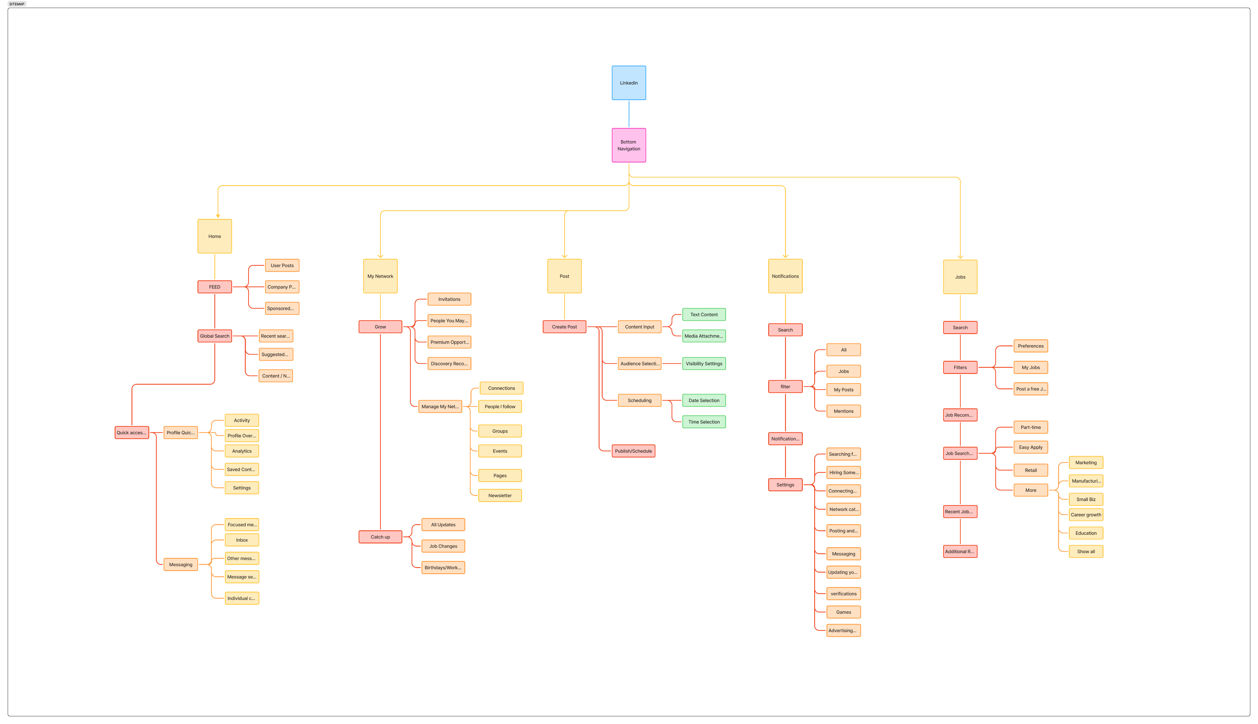
Then I looked at how everything was connected

A content inventory tells us what's inside an app. An information architecture map helps us understand where everything lives and how the pieces connect.

​

I used the inventory to study LinkedIn's existing structure, its navigation and the way different features were grouped.

The three things that made me stop and look

I wasn't trying to prove LinkedIn was badly designed. I wanted to find the little things that could make everyday tasks easier.

So, here's what I'd change

I didn't want to redesign LinkedIn just for the sake of it. I wanted to make a few focused changes while keeping the product familiar.

The biggest change: 5 taps to 2

This was the clearest example of why information architecture matters.

Imagine you've added a new service to your freelance business and want to update your LinkedIn headline.

What this project taught me

I started this project thinking I'd be organising screens and drawing navigation maps.

Instead, I learned to question things I had stopped noticing simply because I used them every day.

​

A label can seem obvious to the person who designed it and still confuse someone else. A feature can exist and still be hard to find. And a small change in where something lives can change how easily people reach it.

​

I also learned that having a good idea isn't the same as proving it works. My next step would be to put these changes in front of users and see what actually happens.